Terry Richardson Photography/Sam Roddick and the (Sexual) Objectification of Women/Male Gaze

This is working towards objective 1, 4.D.

Terry Richardson has always been seen as somewhat of a controversial Fashion Photographer, working with the worlds icons and elite in order to create sexually provocative and objectifying imagery of mainly women, which has become his trademark.

I wanted to look further into this after deciding to use some of his recent works in a developmental and experimental pieces of work – a satirical Kylie Jenner zine as discussed in my previous post – whilst noticing also how pivotal this is to the current industry of fashion and occasionally beauty, especially with adverts for items such as Shampoo and Fake tan. This is shown in the example of a St. Tropez advert featuring Kate Moss in a provocative, sexual pose, highlighting her breasts through the cut of dress, angle of photography, and also heightened further through the crop of the image making this along with her face, the most prominent and ‘appealing’ elements of this advert, sexually objectifying Kate.

st_tropez_kate_c9094

Image Source

Frederickson and Roberts (1998) noted in their writings, “Objectification Theory” that when “women are objectified, women as treated as bodies – and in particular, bodies that exist for the use and pleasure of others”. I feel as though this is represented in the small selection of photographs shown below of both Kylie Jenner and Kim Kardashian, as well as in the St. Tropez ad shown below which all portray women to be objects for the pleasure of men. The images below feature Kylie Jenner using her body and her figure as the key of the photoshoot, with all focus being on her breasts. Furthermore, the images of Kim Kardashian are playful and provocative, whilst sexually objectifying herself through the use of prop and pose choices, hinting at the idea of sex in a not so subtle way. I feel in the way that this shapes the idea of our self-perception and in-turn the perception of others, allows for sexual objectification to become the norm and to taint what we see as ‘ideal’, especially if one already feels vulnerable in the sense to complying to norms and fads to appeal as to what is seen as ‘attractive’.

Whilst this touches on Frederickson and Roberts (1998) theory of Objectification, this theory also coincides with the idea of the Male Gaze. Another theorist, Shields, noted that “[the] ‘male gaze’ transforms women into objects of the heterosexual man’s eye [74] … advertisements and other images of women are shot in such ways that encourage female audiences to adopt a certain perspective when looking at other women and themselves [77].”

I feel that this quote backs up the ideology of the Objectification theory, where women become objects to satisfy the male gaze. I feel through Fashion Photography such as the examples of Terry Richardson’s work, powerful photography in established, powerful magazines and campaigns, can truly impact upon one’s self-perception, and that of others also internalising these visuals and processing them as ‘the norm’.

kylie-jenner-3-600x800-1

Image Sourcerkmfhrczagnuhgqcvaqmbwynsvdpwq-1

Image Source

kim-kardashian-by-terry-richardson-shoot-2016-03

Image Source

kim-kardashian-by-terry-richardson-shoot-2016-04

Image Source

Furthermore, there have been Feminist perspectives discussed by Sam Roddick, a photographer, whose recent works also explore the idea of the ‘male gaze’. Roddick is not only a photographer, but also to the provocative lingerie store, Coco de Mer, which encompasses this as it’s selling point, knowing that women seek approval of males, whilst also in turn, sexually objectifying oneself as an ‘object’ for such pleasure.

A recent exhibition in 2015 titled Hidden Within, showcases her works inspired by work of the designer and architect Carlo Mollino whom throughout his lifetime collected polaroids of women which he kept at a house he didn’t live it. This obsession with women as objects, and in turn understanding how the control of the male gaze has affected such perceptions is important, as this itself is reflected through Roddick’s work.

Roddick noted that, “I came across Carlo Mollino when I opened Coco De Mer … there’s a lot of boring down days working in retail, you know, and that’s when my book collection in the shop was my sanctuary. I’d study his pictures and after a while, I realised the models weren’t posing as themselves; he’d posed them and he’d repeated the poses. Their hands were held in the same manner, flipped at the wrist and after a while you realised that he was sculpting them.”

Examples of Roddick’s work which recreate the sexually dark and controlling work of Mollino.

08_500x636 sophia-a-iv_500x749

Roddick continues to note that, “Terry Richardson is a wounded man. His sexuality is definitely wounded. There’s a sexual aggression in his pictures that’s obvious. From an artistic perspective I like his pictures, from a feminist perspective, he’s an arsehole. I think he wears his damage on his sleeve whereas I feel Carlo Mollino’s damage is way more hidden. When you look at his photos, they’re a lot more respectful than what you see today.” I found this comparison with Terry Richardson to be very interesting in the idea that due to an artistic approach from Mollino and Richardson there works can be said to fall in line with each other, however on a sexually derived level for the pleasure of a mass-audience of males, Richardson’s photographs put out a negative ideal of women to feminists, being more perversive, and objectifying opposed to empowering.

Sources:
Roddick, S. (2015). ‘FROM A FEMINIST PERSPECTIVE TERRY RICHARDSON IS AN ARSEHOLE’ SAM RODDICK ON HER NEW EXHBITION ABOUT THE MALE GAZE. Available: http://www.thedebrief.co.uk/news/opinion/from-a-feminist-perspective-terry-richardson-is-an-arsehole-sam-roddick-on-her-new-exhbition-about-the-male-gaze-20150337965. Last accessed 15th November 2016.
Fredrickson, B & Roberts, T (1998). Objectification Theory. Psychology of Women, 22: Printed in the United States of America. 173-176.
Klein, K. (2013). Why Don’t I Look Like Her? The Impact of Social Media on Female Body Image. Available: http://scholarship.claremont.edu/cgi/viewcontent.cgi?article=1749&context=cmc_theses. Last accessed 12th November 2016.


Professional Context 1 Presentation: Formative Feedback

Today I delivered my first presentation for the Professional Context Module. I chose speak about my Professional Practice within context of my Research Question for this first presentation.

In general I received positive feedback regarding the content I had presented, with some constructive criticism to note going forward in regards to finalising this presentation, the upcoming Theoretical presentation, and the report which I am yet to deliver. I also found that my presentation sparked several ideas from tutors and colleagues in regards to further research references in relation to my practice and research question.

  • Time Keeping: I was over the 5 minute limit delivering my presentation and feel this is due to the amount of content I had written to relay in that time. I had pre-empted that I may of written too much, and feel is due to not being selective enough in what I may of said – I was told I had delivered the ‘breadth’ and now should focus on the ‘depth’. I will note this going forward when revising my presentation prior to submission, whilst taking this feedback on board in advance of the second presentation in a few weeks time. Looking back, I feel as though the way in which I wrote my presentation was perhaps written to much in a ‘formal’ style I am used to, and perhaps could of noted some points on the presentation itself, opposed to feeling the need to relay everything verbally.
  • Ethics: This was noted by tutors during the formative feedback, and was directed to the Ethics Policy the College has in place in regards to warning the viewers on sensitive issues, and how going forward during my research I will ensure Data Protection and Confidentiality for example are thoroughly looked at and embedded in my practice. The ethics I noted during my presentation, and as discussed after regarding working with underweight models caused my own responsibilities and ethics as a designer to come into conversation, especially focusing on the moral issues I face via working in the industry without damaging my reputation, brand or business as a designer and without constricting my audience, whilst staying true to what I believe in. Going forward I will focus on using the Ethics Policy firmly when carrying out any further ‘sensitive’ presentations, showcasing content or conducting research with the public for example. I have downloaded the Ethics Policy and have began reading through and taking in the points and policies which are relevant to my current practice especially in regards to planning my research trip to Japan.
  • Cross-Cultural Understanding and Japan Trip: Noted a positive that I am going to Japan myself to conduct research, but as only going for a week was told to plan an itinerary accordingly, and get in touch with people now in regards to whom I am going to visit making them aware of my research project, and what I am looking to achieve and how I will this information accordingly (ethics, data protection and confidentiality). I was told also to have a contingency plan incase I do not gain the information I am seeking whilst I am there. It was also noted to look for Japanese Institutions for example in the UK, which work with people of the same target audience to that I am seeking. If anything this may add a different dimension to this part of my research project in order to see the differences between Japanese people who live in their native country, oppose to those whom live in the UK.
  • Looking at the Communication Theory was also noted in context to my field as a Graphic Designer/Digital Illustrator.

Now having seen all of my colleagues’ presentations, I feel it is very interesting how diverse a group of practitioners we are in regards to our methods used, however have similar thought processes and underpinning theories or ideas which make us all connect in some way, whether this be relevant contemporary or traditional artists for example, such as Barbara Kruger which was also references in regards to several other interdisciplinary practices.

I also found it touching how many had related their current practice back to a previous or even current personal experience. I found also that these colleagues would be good to work with potentially in the future on a collaboration, or even if simply for interdisciplinary discussion and idea building.

It also came to mind that many are conscious of ethical issues in their own and surrounding practices, and how this reflects on their own work as well as how it is perceived. Cross-cultural issues were also raised along with colleagues also looking at the contrasts between the East and West in context of the positioning, inspiration or audience of their work which I resonated with in regards to my practice.

I found these sessions very informative and inspiring in regards to collaboration, discussion and research and feel I can also really learn and develop my own practice through working with such an eclectic, diverse and interdisciplinary group of practitioners.

Zine Project: Development

This is working towards objective 4.C/D.

I had originally planned on this initial zine to include much more research based content, however, feel that as the emphasis so far has been developing the Instagram/Poster project which has unexpectedly taken off, I feel it is more relevant and appropriate at this moment in time for the zine to coincide with this project also. This allows for the idea of a zine-like publication to actually have a real purpose where at this moment in time, I do not feel as though I have enough research which I would want to include in the zine, and feel it would be better to wait to develop this when I have carried out more primary research and conducted my interviews, whilst also waiting until I have been to Japan and carried out the planned field-research there.

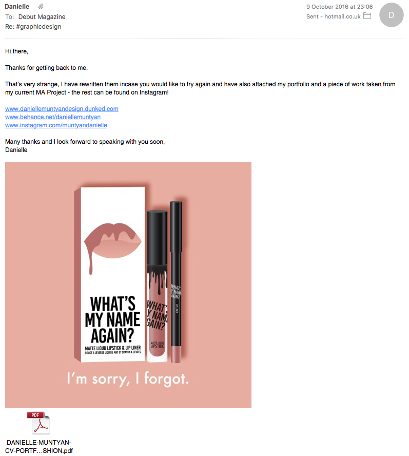
Therefore in response to this, the zine which has been produced is respective of the work done to date promoting the concept and idea behind the “What’s my name again?” campaign, including an overarching theory on ‘Identity’ based on previous research and posts regarding this in context to the findings of Turner and Tafjel (1986). This is emphasised by the quote by German Philosopher Friedrich Nietzsche regarding the idea of ‘power’ which I found particularly relevant to the context and subject matter at hand. Furthermore, the idea of using the lipstick shades again as a basis for reflecting ideas and theories has been used throughout in an advertising style reminiscent of that of Barbara Kruger using Tabloid red and white typography to showcase key pieces of typography and relay the message at hand.

“All things are subject to interpretation. Whichever interpretation prevails at a given time is a function of power and not truth.”
– Friedrich Nietzsche

In addition to this, I have also touched on the topic of social media and how this affects our self perception, the perception of others and in turn how this makes one feel and act being an ‘icon’. I feel as though I have also reflected this in a satirical manner, creating a parody towards Kylie Jenner and her influence on a mass-public audience which is also reflective of the rest of this collective project. To represent the ‘icon’ an ‘icon’ as been created which is similar in aesthetic to that which Jenner is associated, highlighting the shades/theories even more allowing for the target audience to follow the concept, understand and share the message via the use of the various forms of promotional collateral designed, prototyped and produced to date.

zine-v1-digital

zine-v1-digital2

zine-v1-digital3

zine-v1-digital4

zine-v1-digital5

zine-v1-digital6

zine-v1-digital7

zine-v1-digital8

zine-v1-digital9

Below shows photographs of the perfect binding binding process which I experimented with, however due to having a small amount of pages (16) in total with 9 spreads, it became evident that a different form of binding such as stapled or coptic stitching would be better suited.

Photographs showing this can be seen below. It is evident that using this method benefits from using a larger amount of stock, as previously noted during the initial postcard book development also. I do not feel that visually this prototype lives up to the standard or quality of the other products and printed collateral created, and taking this forward will also experiment with thicker stocks and gloss stocks to again sit better inline with the remainder of the product, whilst giving more weight to the product and helping it feel much more substantial as a publication.

20161031_001814_1477879783657_resized

20161031_001815_1477879775764_resized

20161031_003000_1477879773480_resized

20161031_003012_1477879771506_resized

20161031_003052_1477879769580_resized

20161031_003057_1477879767202_resized

20161031_003116_1477879765816_resized

Image and Quote Sources:
http://media.thecelebrityauction.co/picture/c/86/CwMdBE5KXRoIAhUABw4DH1kVSxMYBA4TDBwHWQcRAEoHAQxMHwIdB00PHRgASBsRFwJfBwsWGxEQXx8HE00RChlMGQwDB0oFA0gA/HQsABhkdWwEVHhwEBwFKRlNGXFtEXF04HA8bACspEgcaERctNAQPHRcRPDoIEytXX0JRV0NSR1ZGUEFaDwIUWhIHBBgKAxBJREtK/RkMFHRcZAgNUHgQCVAQMBwYNSVdPWQ==.jpg, Last Accessed: 28th October 2016
http://blog.streetwearofficial.com/wp-content/uploads/2015/09/kylie-jenner-3-600×800.jpg, Last Accessed: 28th October 2016
Nietzsche, F.. (2016). Quote. Available: http://www.goodreads.com/quotes/22323-all-things-are-subject-to-interpretation-whichever-interpretation-prevails-at. Last Accessed: 1st November 2016.

Further Development: Colour Perforated and Die-Cut Postcard Books

This is working towards objective 4.C.

Following producing blank card prototypes of the perforated postcard books I had developed, I wanted to further take this forward using printed stock to visually mockup the final product and to further test binding processes.

The postcards were printed double sided with the addition of a postage stamp outline on the top right hand corner of the reverse.

To to do so, the postcards were laid out on Silhouette Cameo die-cutting software in sets of 3s to ensure that the cut-lines when re-run through the machine post-print would be in-line. With this prototype as shown below I struggled with this slightly at first as each seemed to be slightly of by 1 or 2mm apart from 1 sheet of 3 A6 postcards. I wanted to test this visually at this stage more than anything, and will re-do this process to achieve a perfect outcome.

I also made an error in that I printed the wrap cover in 3 panels opposed to one wrap cover, so when constructed looked bulky and not as neat as I had wanted at the top. Going forward I will ensure a wrap cover is printed on A3 stock which can be trimmed to size once secured in place at the spine of the postcard books.

20161027_132444_1477577789051_resized

20161027_132455_1477577771018_resized

20161027_142930_1477577786694_resized

20161027_142944_1477577767805_resized

20161027_143015_1477577765294_resized

20161027_144432_1477577756701_resized

20161027_145529_1477577753636_resized

20161027_150513_1477577750484_resized

20161027_151053_1477577747394_resized

20161027_151103_1477577744257_resized

20161027_151115_1477577741268_resized

20161027_151206_1477577736103_resized

Following my comments noted above, the process was carried out again and was carried out again however, I only used the die-cutter to perforate the card which allowed for more control over where the cutting was going to take place. This was tested on black card prior to cutting to avoid wasting printed stock. Once perforated, the postcards were cut by hand using a metal and ruler and scalpel for precision. I found this process to work better and more accurately, however it is more time consuming. In addition the wrap cover, as shown below, was also printed and used as noted above in order to achieve a more seamless and professional finish.

I found that the second time around I applied the findings of my own errors to ensure a better result was realised, and tested myself on finding new ways of creating this product, as discussed above, as this is not something which I had tried, nor considered before as a viable process until I had to re-think my processes and methods.

screen-shot-2016-10-29-at-00-37-04

screen-shot-2016-10-29-at-00-36-57

DYLON Tote Bags

This is working towards objective 4.C.

In a previous post, I noted that I was unsure of the colour of the natural tote bags used and was planning on dyeing them with DYLON dye.

I attempted to do so using 3 different colours, ‘Powder Pink’, ‘Velvet Black’ and ‘Pebble Beige’ as shown below, and followed the instructions – also shown below – intently, as I had never done this before. I was unsure at first how the fabrics would take to the hand dye, and in retrospect feel that a machine wash dye may of been better suited.

The results as shown below, show that in some places, particularly on the black tote bags, the colour is uneven and not a true black which was not the desired outcome. I feel this is due to the process and the fabrics being quite thick, and therefore may of benefited from a different process. However, I am glad I have tried this process as it enabled me to test different vinyl colour combinations to choose one or two to take forward if this project is to be further developed next semester. However, I would choose to purchase pre-coloured tote bags, or dye my own bags using a machine wash process. In addition, I would also purchase cotton tote bags opposed to natural canvas as also feel aesthetically these are more suitable and suited to the end user, and would also take the colour pigment better.

I also found that when washed the tote bags shrunk slightly in comparison to the none dyed bags. This is due to the fabric being porous and natural, and therefore again feel this is another reason to use cotton bags going forward.

20161026_215320_1477577820648_resized

20161026_215324_1477577817839_resized

20161026_215334_1477577814741_resized

20161026_223848_1477577811674_resized


20161026_225041_1477577805288_resized

20161026_224319_1477577808327_resized

20161027_111158_1477577802088_resized

20161027_115901_1477577800396_resized

20161030_205648_1477879780729_resized

20161030_205653_1477879778158_resized

A6 Digital Print Set Mockups

This is working towards objective 4.C.

In addition to the A3 posters, A5 Prints and A6 Postcards, I also wanted to include a range of A6 digital prints. This allowed me to further test digital printing processes and stocks – gloss 120gsm paper has been used for these prints – whilst also trailing other forms of packaging, using stickers opposed to mountain fold labels, in order to test visually which is more effective and suited to the target audience and purpose.

The same principal is in mind with these prints, with the target audience being those whom are engaged with the beauty industry and most likely in their teens to late 20s, may want to stick these on their walls, put them on their notebooks and share them with friends – once again keeping the ‘sharing idea’ in line throughout all of the products associated with this project.

Poly bags were used again, however this time sticker labels were created on my Silhouette Cameo die cutter which were then transferred onto the back of the bags. Prior to this I tested the colour of the prints on the stock on my laser printer and found the black to be quite patchy. Furthermore, I felt the pink was more in-line with the brand and that black should be included more but in a different way and using a different stock. I would also use a different print process such as Ink Jet potentially or Screenprinting to ensure that the black is a true black, if I was to use black as a key colour again on printed materials. The process chosen would depend on the amount of artwork which would need to be created to make the process, cost and time viable and appropriate. For example, screen printing would not be suitable here to produce 1 or 2 labels due to the timely process involved and would be better suited to a different digital print process upon further experimentation.

I am happy with the final outcome as the packaging feels secure and allows the artwork itself to speak to the end-user, however feel that the mountain-fold label allows for a more visually appealing product and also reiterates the brand, idea and product purpose more instantaneously with more impact.

20161026_130842_1477519787742_resized

20161026_181707_1477519760281_resized

20161026_213822_1477519717473_resized

20161026_213829_1477519719611_resized

20161026_213837_1477519724152_resized

20161026_214212_1477519710695_resized

20161026_214220_1477519708132_resized

20161026_214233_1477519705844_resized

20161026_222858_1477519699009_resized

20161026_222905_1477519696290_resized

20161026_224757_1477519694312_resized

20161026_224805_1477519691980_resized

20161026_224819_1477519686502_resized

Updated “What’s My Name Again” Range Board

This is working towards objective 4.C.

Following the development of the cosmetic products as shown on my previous posts, I have updated and revised the range board which sits with this new development (product design) of the project.

The board now shows a range of products, the right hand side being the Tote Bag Packs and on the left, the cosmetic products. A product information label has also been placed on the bottom left so it is clear for viewers which product is which. I feel this range board is much more visually effective than the previous, showcasing how the ‘range’ has developed over time from initial Instagram Posts and Poster designs.

I will mockup and prototype which products I can in advance for submission and to allow myself to experiment further with ideas and processes (stipulations and potential have been discussed on a previous post), however also plan on submitting a final range board encompassing the whole project and what my initial idea has developed into.

range-board-2-01

STAR Magazine: Scans and Analysis (Issue 659, 24/10/16)

This is working towards objective 1.

I came across this weekly magazine in my local CO-OP whilst waiting in a queue. I do not normally purchase such magazines, however felt obliged to purchase this in regards to research purposes. I saw the cover and was instantly taken back by the relevance in association to my research question, and more relevant, my current exploratory practical works and concepts focusing on the fashion and beauty industries and how they can unknowingly at times, affect our self-perception.

I have used Kylie Jenner as a focus throughout one of my initial projects being a natural progression from the success of initial one-off Instagram posts focusing on the power of her icon status and subsequent beauty brands, in turn influencing our self-perception through a following of almost 80m on Instagram, in addition to her app and TV shows for example.

Furthermore, the idea of competition within this article was intriguing, “Kylie tried to steal Kim’s crown” especially between two sisters, with Kylie in the photograph shown on the cover below, donning a Kim Kardashian ‘pose’ and donning a similar physique. At the same time, she is consciously pulling up her top to reveal her body, taking the photograph herself, showing how technology and media can drive a media storm making front page ‘news’. Being conscious of this Kylie is objectifying herself (self-objectification) knowing what sort of reaction she will receive from her following and the media alike. But does this self-objectification and narcissist trait perhaps, resonate with the ‘icon’ themselves that they are causing potential damage to those who view such imagery and articles, altering their perceptions and beliefs in turn? It is obvious that magazines such as Star, have no objection with objectifying, and showcasing women theirselves in order to gain sales.

Furthermore, as also touched on in my previous research and practice is the current fad of ‘lip fillers’ within the beauty and fashion industries, with celebrities, bloggers and icons alike seen with such augmentations. In addition to this, on the cover are also procedures such as ‘nose jobs’ and bottom implants. What I did notice however was that even though the headline “surgery shockers” at first appears quite negative, with the subtitles supporting this negativity in a sense of shock of ‘bad changes’ and bad perceptions. None of these procedures and the ‘finished looks’ have been seen as ‘beautiful’, ‘ideal’ or ‘perfect’ by the writers, and have instead been relayed with such terms as “destroyed her lips” and “wonky” suggesting to the reader, for once, that perhaps this is not such a good idea and infact can cause judgements and negative perceptions. Will this overtime impact on ones self-esteem through the gaze of others, leading to the self-surveying gaze to shine through and alter ones body again – but was this why the surgery was done in the first place? And are they changing due to feeling like they don’t fit in? This is resonant of Tafjel and Turner’s (1979) Identity theory where one may change their appearance to ‘fit in’ being “out-group”, and by making such changes to become “in-group” they feel as though they will be ‘accepted’. I believe that this is the same for celebrities and icons, feeling the need to compete and constantly comply with trends and the actions of those around them in-order to maintain a positive identity, and sense of positive self-perceptions. However, this as also noted in Taflej and Turner’s (1979) model that this cycle can cause depression, mental health issues, anxiety and eating disorders for example.

I feel looking at this cover alone, I have already noted Fredrickson and Robers (2008) Objectification and Self-Objectification theories, Tafjel and Turners’ (1979) Identity Theory, Shields (2013) Self-Surveying Gaze and Bem’s (1972) Self-Perception theory, and feel as though these can be relayed throughout the articles also noted below, but more importantly show how many issues, topics and debates can arise from only a very small segment of research and examples. I feel also that this cover alone evidences many of the points I have made, or am trying to raise through my current practice and research, and feel it is research and current examples such as this which evidence and satisfy my research question.

I am interested to compare such covers and articles to that of more ‘highbrow’ magazines to see comparatively how such topics of discussion are relayed in regards to both, copywriting and visuals.

I have made bullet points below in regards to the other scanned in articles, in relation to my research question, research to date and current practice.

star

star-1

Above – left page:

  •  ‘Thigh-gap social media fad’ as noted in previous research in relation to Luisa Omielan and Anne Robert’s “Body Image Secrets” documentary, being explicitly showcased by Kylie Jenner due to her body positioning and pose.
  • Competitive tone used in headline suggesting competition with one and other, even siblings, to be perceived as the ‘best’, ‘perfect’, ideal’ both in terms of figure, beauty and social media status.

star-2

Above:

  • Highlights previous research and focus in practical work (Instagram posts/well being campaign proposal) on photo-manipulation using photoshop, filters and apps.
  • This article notes the “fails” of doing-so which highlights to me how this could then alter one’s perception and self-perception through being exposed to having a different physique as put out for so long in the media, whilst using such editing methods can also be frowned upon by those who look unto icons, but then do it themselves, hinting also at double standards. This is also noted above in the article, “What a hypocrite! Telling young girls not to get plastic surgery yet she photoshops a photo to make herself look thinner”.
  • “All this photoshopping just shows how inadequate they feel about themselves” is a quote from a ‘commenter’ quoted by Star, highlighting the points made above.
  • Photoshopping and any form of photo-manipulation – does this highlight our insecurity of our identities and by making such changes one attempts to alter this in order to ‘fit in’ and be accepted?
  • Highlights the heavily researched and discussed topic of ‘natural’ within the beauty industry currently, especially in relation to Tarte cosmetics for example (see previous posts). The same taboo topic is also noted in the article, “fans have blasted her a hypocrite for altering her snaps, after she recently promoted natural beauty with an anti-survey campaign” after having a range of procedures done such as, breast augmentations, lip fillers and botox, and previously admitting she had gone overboard.

star-3

Above:

  • I found this page in particular interesting showcasing celebrities in their ‘natural’ state which I found quite compelling in a positive way. I feel even though these types of magazines are usually know for their celebrity filled covers and brash headlines, however feel very surprised by how none of these articles really in a direct way encourage lip fillers for example. Above shows another example, relaying to the viewer that celebrities are real people, and do not look flawless all the time. However, as shown below, ways to then change ourselves are advertised on a following page showcasing new and on-trend beauty products.
  • Some of the quotes used and comments made resonate with the idea of self-perception, identity and belonging as under ‘Ashley Greene’, it is noted “it’s nice to know [she] looks just like us”, almost seeking acceptance and validity for how we look without makeup. Furthermore, celebrities such as Charlotte Crosby have been recorded stating “EmbraceTheForeHead tag a friend who has a MASSIVE forehead” allowing her social media following to know that she is okay with her insecurities and wants you to be okay with yours, and your friends, and hers also. I feel that this is something which could be done by ‘icons’ perhaps in ‘even higher places’ with much much influence, however this would then damage their reputation and the identity they have built through shaping perceptions.

star-4

Above:

  • As previously noted above, even though the articles analysed do not directly encourage one to go and get plastic surgery for example, and in fact does shed a more negative light on it than a positive change, a few pages later, a beauty page appears with ways in which are encouraged in order to change your appearance to reach an ‘ideal’ or a certain look, as shown by featuring Cheryl Cole as a visual reference.
  • I also found it interesting that sponsored products (L’Oreal) are noted in regards to Cole, and therefore maintains her reputation and identity built with the brand, whilst also her image, and power to sell products in order to get the exact look she has been photographed wearing, is only in the best interest of the brand. Therefore, often our perceptions and self-perceptions are designed and curated by the brand and icon powers at large at a particular moment in time.

Source:
STAR Magazine, Issue 659, 24th October 2016

CAD Development

This is working towards objective 4.C.

I wanted to include a short post regarding the process used for CAD development. I find this to be a good way of testing ideas quickly and effectively as I feel this process gives a highly visual, and at time very realistic outcome.

Initially, I would place the key component on an Adobe Illustrator art board, and scale this accordingly on the page in order to build a framework to build the rest of the elements around – i.e. ‘doors’ on the front of the packaging concealing the products. This ensures that the whole CAD design will be to scale in relation to the key product – the liquid lipsticks. At this stage they are all pink, however using the Poster/Postcard featuring ‘the whole collection’ of new shades, I would alter the product colours accordingly ensuring they are all different, and ensuring that the main theories and ideas which I am wanting to portray through this idea/design are used as relevant shades. Colours used can be seen in the Swatches box below.

From this, using the ‘doors’ to create the front of the box/packaging, a ‘drippy lip’ has also been included which would be die cut and this would be the element which secures the packaging when closed – this could be done through a die-cut arc, or through the use of velcro for example. This would depend on the weight of the final product in real life, however this has not been reflected on the CAD design. I have simply ensured that I am aware of how this would be mocked up/made in Industry, so if I am able to produce a version of my own through further development and sourcing of the correct containers (discussed on a previous post) for example, it would be a viable product to pitch and produce. If I could source the corresponding colour product in an unbranded container, I would be able to use clear vinyl to mockup these products, however this needs researching further and is time permitting.

Following this I then changed the colours of the packaging according to the developed identity and theme used throughout the other product range. The pink was introduced along with gradients to add depth and dimension to the add. These can be seen in the Swatches panel also shown below.

Finally the corresponding artwork was added, allowing the end-user/consumer to know which shade is which (in this case theory or idea surrounding the concept of the project), along with the title, “What’s my name again?” and relevant product copy.

screen-shot-2016-10-26-at-01-29-36

screen-shot-2016-10-26-at-01-45-52

screen-shot-2016-10-26-at-01-45-44

screen-shot-2016-10-26-at-02-03-20
lip-set-01 screen-shot-2016-10-26-at-02-03-36 lip-set-02