NEW IDEA DEVELOPMENT: Badges & Badge Boxes

This is working towards objective 4.C.

Following the making of the postcard/postcard and print sets, I was thinking about further ideas which could be executed around the same idea of sharing. I came across the idea of badges, which really excited me thinking about the materials I could experiment with and the ways in which they could be packaged.

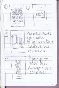
I drew some initial sketches which outline the idea shown below, whereby the badge would be contained in a box, to add value, protect the item and to also qualify as a gift in order to share with friends and spread the message regarding beauty and its influences upon self-perception and body image. I really find the idea of sharing this message through social groups relevant and key, both via social media or in-person. I also thought these badges would be a good addition to the ‘goody bags’. These could be contained in poly-bags with a mountain-fold closure as seen on the postcard/postcard and print packs.

badges-sketch

Below shows further development of this idea, and how this could be taken forward into single badge boxes, duo sets and gift bags CADs and packaging nets have been drawn to demonstrate this.

They have not been drawn to scale, however have been drawn to test the nets, the stock and finish needed and the amount of weight which can be held in the box, allowing for myself to work out and experiment with the best form of inner in order to both kept the box in tact, but also securely hold the badges in place.

By continuing to develop this idea, I am hoping to experiment with colour, process, technique and a variety of materials. I feel this will be a really good, impromptu project to get stuck into surrounding my other projects in order to learn and develop hands-on processes as well as digital and binding skills for example. As this project was not planned originally, I am having to build this in around my weekly plans and schedules, so may be hard at times however, I am very keen to take this forward and fulfil it to the best of my ability. Furthermore, I feel this will be a good hands-on challenge opposed to working digitally as I do with most of my personal and professional practice being a graphic designer.

I am aware of all of the processes used and have at some point experimented with them all over the past 10 years whilst being in education, however would like to delve back into this to improve my skill set and enhance my knowledge. This will also give me a better understanding if I am ever to use these processes or techniques in industry, for example, or during collaboration with interdisciplinary practitioners.

Annotations have been noted on each page below to clarify and cover any process details or further information. I plan on evaluating and analysing these processes as I carry them out in order to work towards a final prototype which potentially may be taken forward for further development and project realisation in semester 2.

badge-box-cads-rgb-01

badge-box-cads-rgb-02

badge-box-cads-rgb-03

badge-box-cads-rgb-04

badge-box-cads-rgb-05

Prototypes: Postcard and Poster Packs

This is working towards objective 4.C.

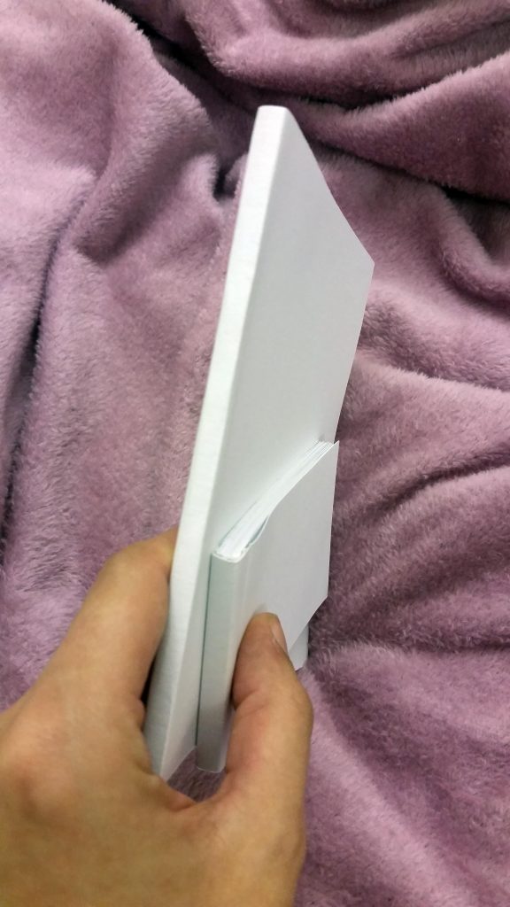
Above shows images from prototyping process of making postcard and print packs. This idea came from the perforated postcard books, when I was reflecting upon the process and outcome, and was thinking of other ways of binding. I then decided to create packs based upon the same idea that they can be shared with or without messages with friends and family, in order to spread the message on the idea of the beauty industry and its effects upon self-perception.

The process of creating these low-cost and low-tech prototypes can be seen below.

1: Choosing a stock – the stock on the left is true white 90gsm matte finish, and on the right is 120gsm silk finish pearl paper. The photograph actually makes the paper look much more yellow than it is, it is an off white with a semi-gloss finish. As I was using a laser printer to test this idea, I decided to print postcards initially on to each in order to make an informed decision on which to use. I noted that either would need a card backing – if and when produced for a final outcome, these would be digitally printed double sided onto card, to avoid this mocking up process for each set, whilst achieving a much more professional finish also. However, during this early stage I am happy to go through this process to test ideas and stock also so going forward I come into no issues and finalising the sets will be easier. I chose to use the 120gsm silk finish stock for the front of the postcards as I felt it made the colours deeper in comparison to the matte, as the paper stock hasn’t absorbed most of the ink drying to leave a darker colour. I also felt that for postcards and in-line with the poster development would be more in-line with the gloss stock chosen.

20161023_161541

2: These prints were then mounted onto 18ogsm card, and cut out accordingly to create the visual side of the postcards. The back of the cards were then mounted with a corresponding pale pink back with writing spaces for content and address.

A selection of 5 designs were chosen for the postcards and 2 designs for the prints, simply to ease the process of selection during the prototyping and mocking up process as I wanted to focus more on the quality of print and execution.

3: The A5 prints also went under the same process, however have not got a ‘postcard’ back and remain white.

20161023_181407

20161023_181356

4: The postcards and prints were then placed into the relevant polybags – A5 or A6.

5: I wanted to create some form of tag for the packs to not only share what the contents is, but also suggest how to use them in regards to spreading the message. I decided to create mountain-fold cards which contain the title and slogan on the front, with extra details on the back. These would then be secured to the polybags, using double sided tape. I chose to use tape over a stapler to not damage the cards and to also give a cleaner and more professional finish.

20161023_181221

20161023_181233

20161023_181237

6: The packs were then sealed in order to place to folded cards over and secure.

20161023_181840

20161023_181830

img_20161023_181911

Overall, I am happy with the two prototypes created as I feel they are clever yet fun ways of spreading and sharing a message, and feel that even though the process was quite long-winded producing one-off prototypes, these could be very commercial if printed professionally, perhaps with a larger variety of content and packs.

I would like to produce sets which have different colours tags creating a variety of sets inspired by the chosen postcards for content, and feel these would be good in a larger pack of items, i.e. goodie bags – tote bag with prints, badges, stickers, etc. This would also add a second use to the items I have been designing and prototyping with recently.

Further Postcard Development and Mockups

This is working towards objective 4.C.

2016-10-20-16.26.30_resized.jpg.jpg

I decided to further develop the single postcards into a perforated postcard book, whereby the cards can either be used as prints on a wall for example or shared and sent amongst friends and family for instance, sharing the message on how the beauty and fashion industries affect our sense of self-perception and body image, whilst also attracting engagement and interaction from the user in the same way that on social media one would tag a friend in a post which may be of interest or relevance to them too.

I plan on producing mockups of these to test the functionality, binding, perforation and stock.

Below shows the process of producing the prototypes.

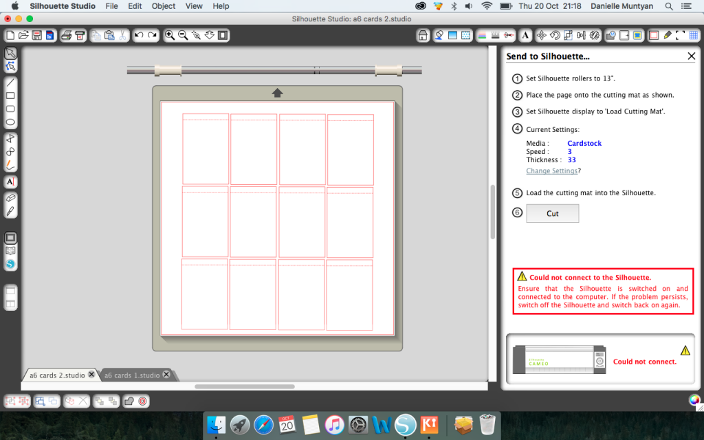
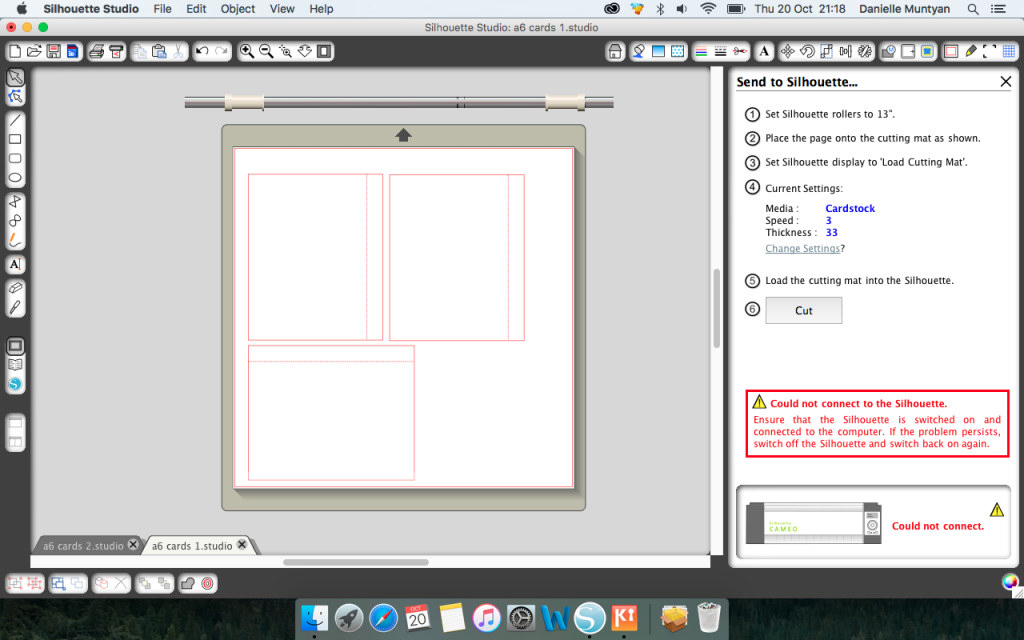
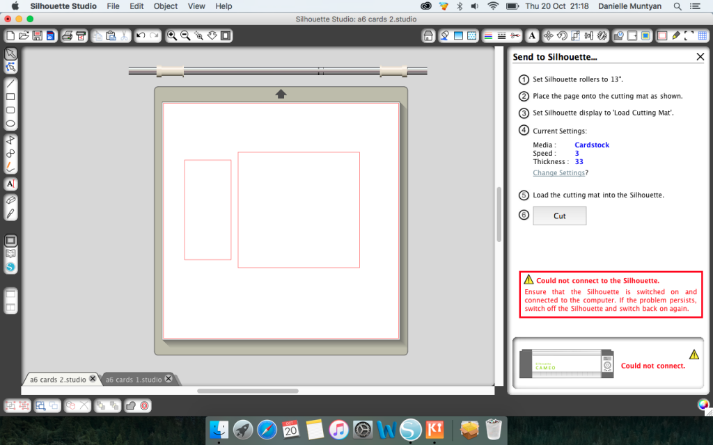
  1. I have used my Silhouette Cameo die-cutting software and tools to produce perforated postcards. Below shows the setting up and drawing out of the A6 cards with 1cm bleed – solid lines are cut lines, dashed are perforated. I really enjoy using this process as is methodical and very accurate, allowing for the books to look professional but at a low-cost of production. The outer covers of the books have also been drawn to ensure that the cover fits accurately and conceals the spine.

screen-shot-2016-10-20-at-21-18-51

screen-shot-2016-10-20-at-21-18-35

screen-shot-2016-10-20-at-21-18-31

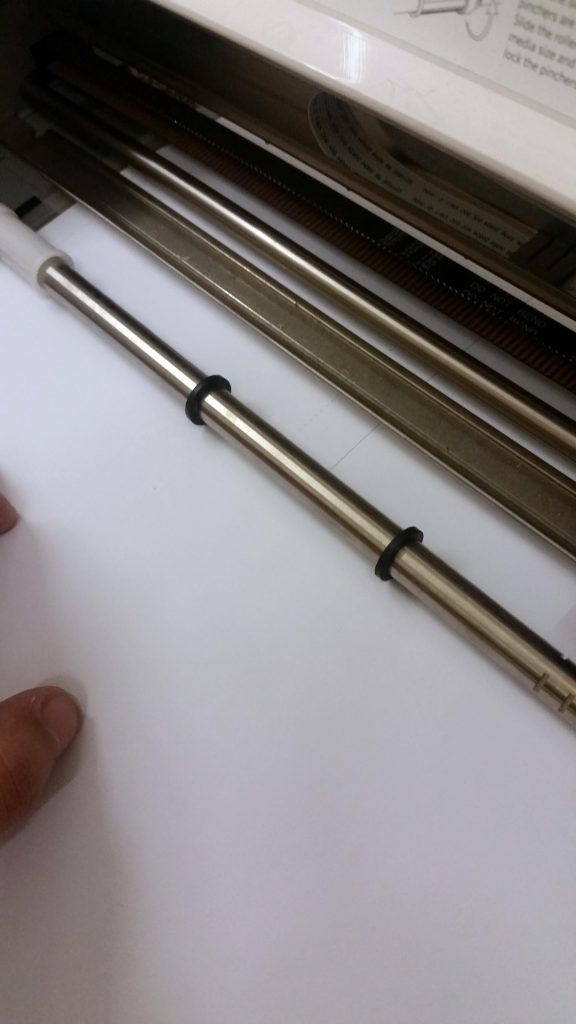
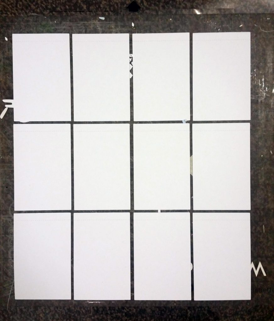
2. Below shows the paper on the cutting mat, which has been inserted into the Silhouette Cameo allowing for a blade to cut the paper. I find die-cutting a better way of cutting paper than laser-cutting as it does not burn nor leave marks on white paper in particular. The only thing to consider is that the blade is sharp and new to ensure that no pulls are made when the paper is on quite a fast cutting setting.

20161020_191038

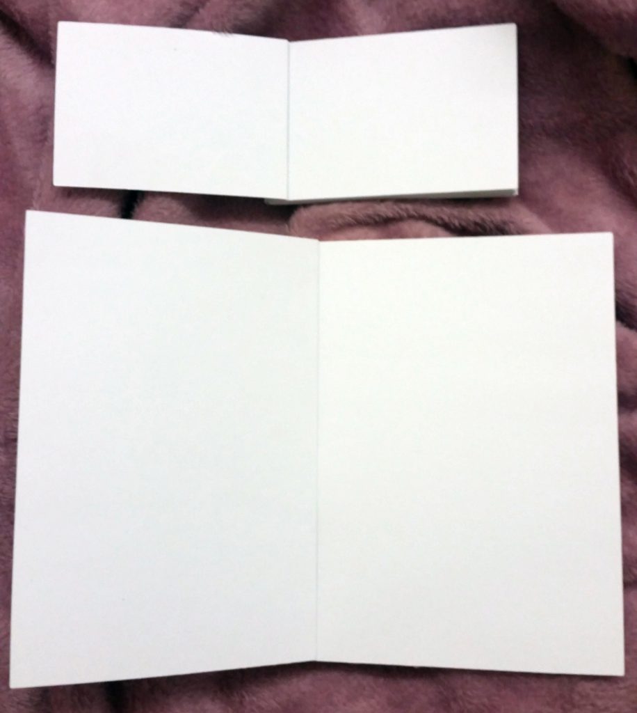
3. Below shows the cut edges and perforated tops of the landscape postcards. These have not been cut out to scale, and have been simply cut to test which orientation works best when bound together in regards to aesthetics and sturdiness. The excess paper has been removed below also to show the cards which are all exactly the same size.

20161020_193752

20161020_193823

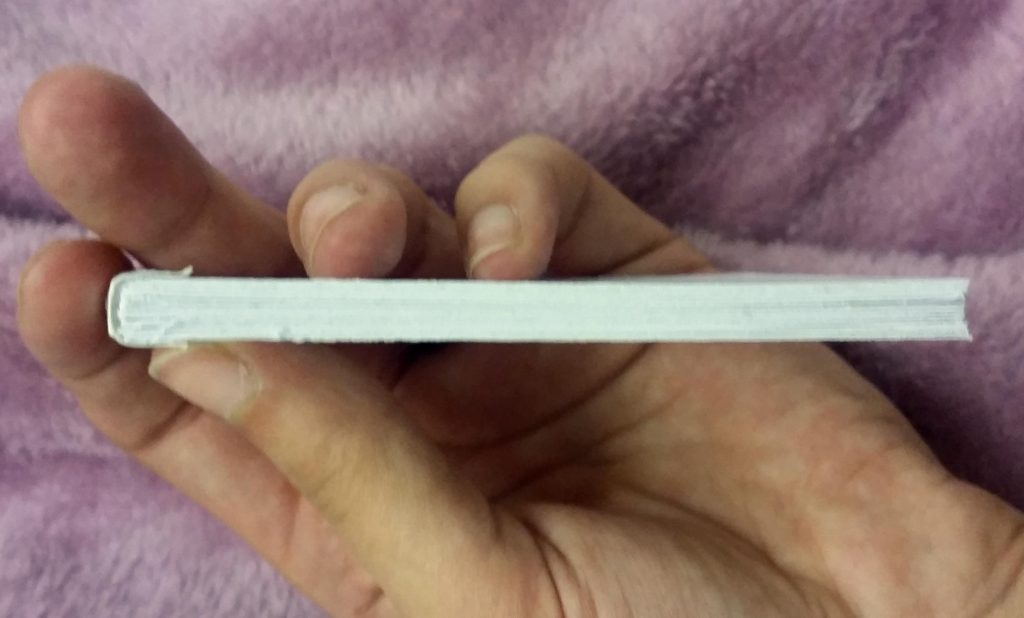
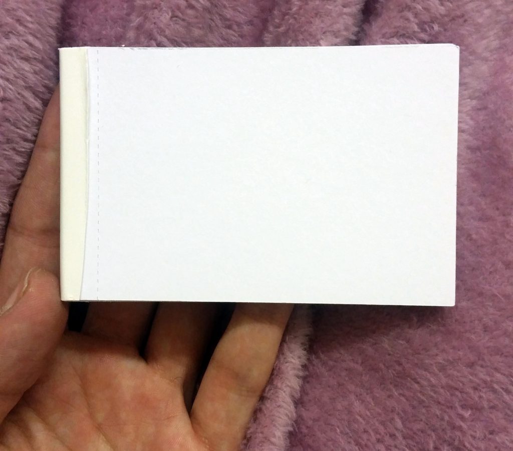
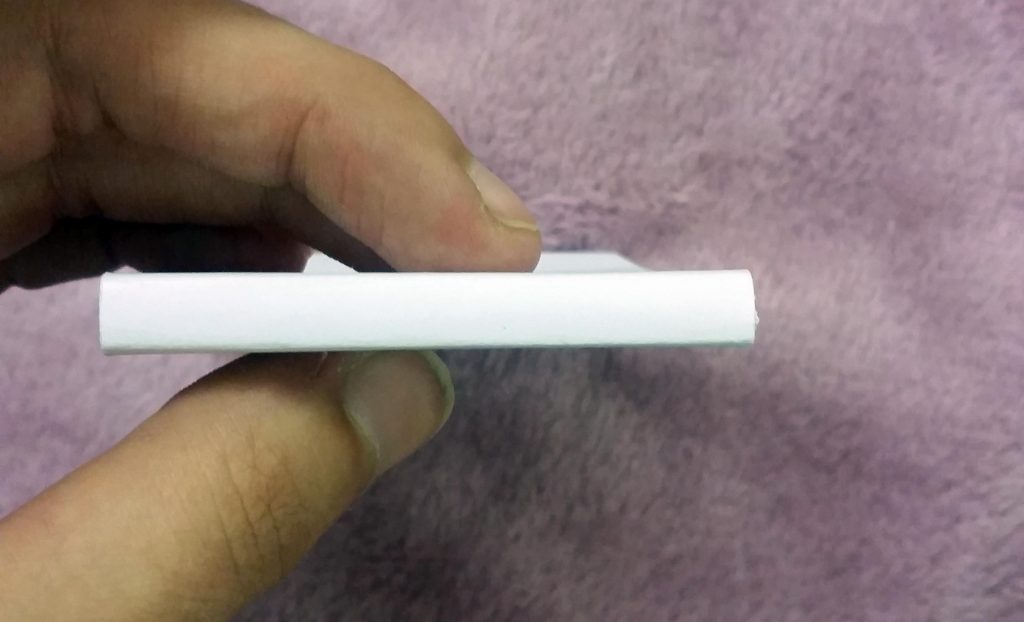
4. The next step is the perfect binding of the books. To do this I have used glue strips, and my Therm-A-Bind machine. The strips as shown below are placed down the spine, covering the inner pages protecting them from curling from heat and glue. Once heated for a minute, the glue binds to the spine and then cools solid. It is important at this step to ensure the pages are all inline and secure with no fallouts, as well as ensuring that no glue has seeped between the edges, which ensures for a professional finish. After this, the excess glue strip and backing is cut off leaving a simply bound book. I found that the portrait book had less pages and therefore didn’t finish as neatly, or ‘perfectly’ as I’d of liked in comparison to the landscape book. This is something in the future I would improve on and include 20 pages opposed to 15.

20161020_200042

20161020_200106

20161020_201129

20161020_201146

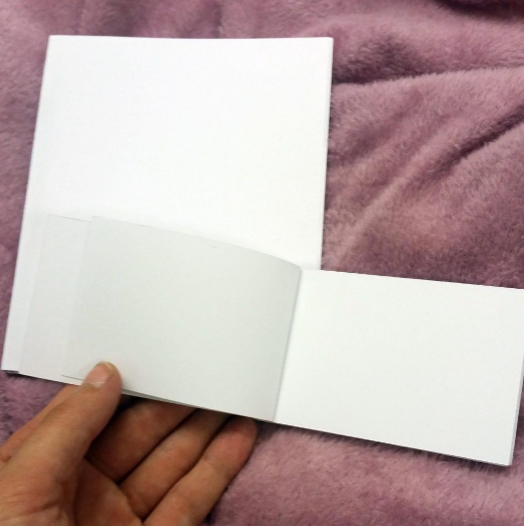
5. The outer cover is cut and then wrapped and securely glued at the edge, leaving room for a fold line at the 1cm bleed in order to ensure the cover folds up and allows the perforated postcards to be removed individually. This is shown below.

20161020_201750

20161020_202349

20161020_202412

20161020_202423

20161020_202433

20161020_2024120

20161020_202910

Overall I am really happy with these perforated books, and think the next step is to produce a mockup including full colour postcards.

At this stage, I realised once I looked at the prototypes above and that I now needed 20 postcards, I need to develop more. These are shown below – an expansion of previous designs keeping inline with concept, aesthetics, theme and idea.

postcards-2-14

postcards-2-13

postcards-2-12

postcards-2-15

postcards-2-16

postcards-2-17

postcards-2-18

postcards-2-06

postcards-2-08

postcards-2-09

postcards-2-10

postcards-2-11

postcards-2-02

postcards-2-04

Postcards: Development and Experiments

This is working towards objective 4.C.

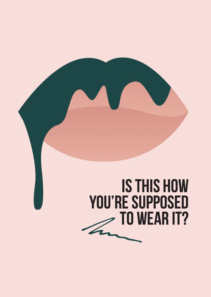
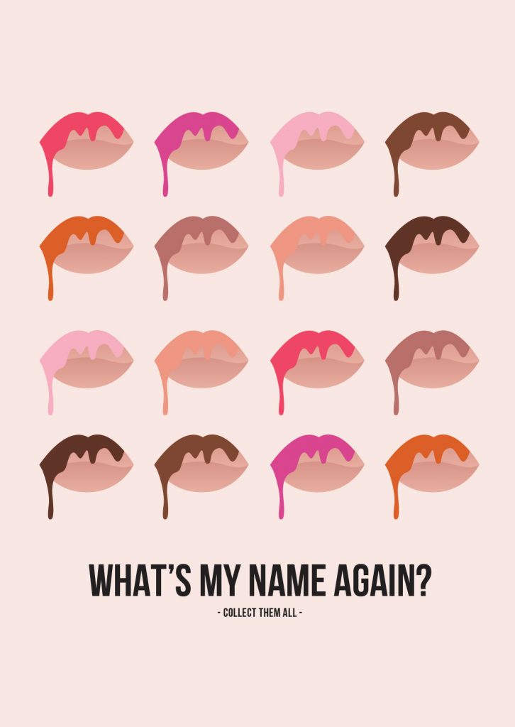
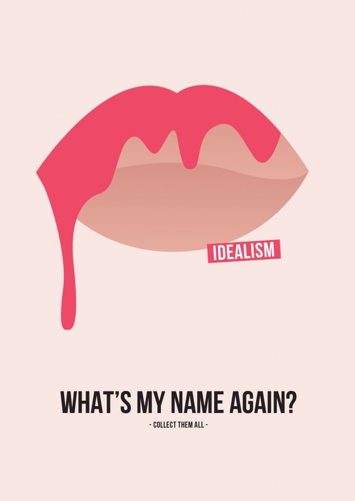
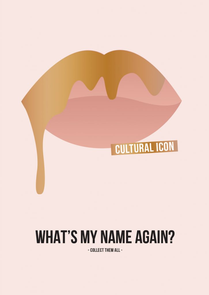
Adapting the posters into postcards was a part of the Poster Series/Blogging Posts brief that I had not planned on originally, however felt they may be good promos or teasers to hand out promoting the final series of posters for example if this is realised into a final project. I also envision these to be handed out in promo packs, consisting of Tote Bags, Posters and Postcards. Therefore, below shows my experiments with layout and composition.

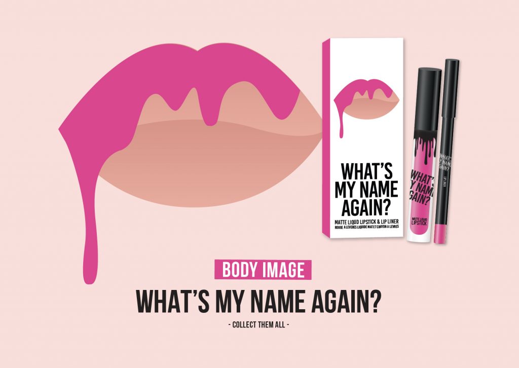
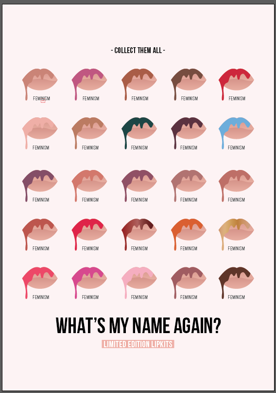
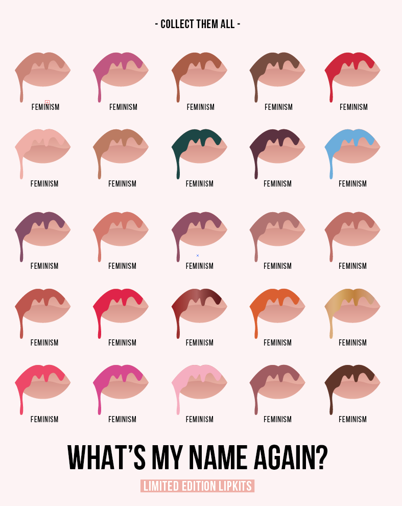
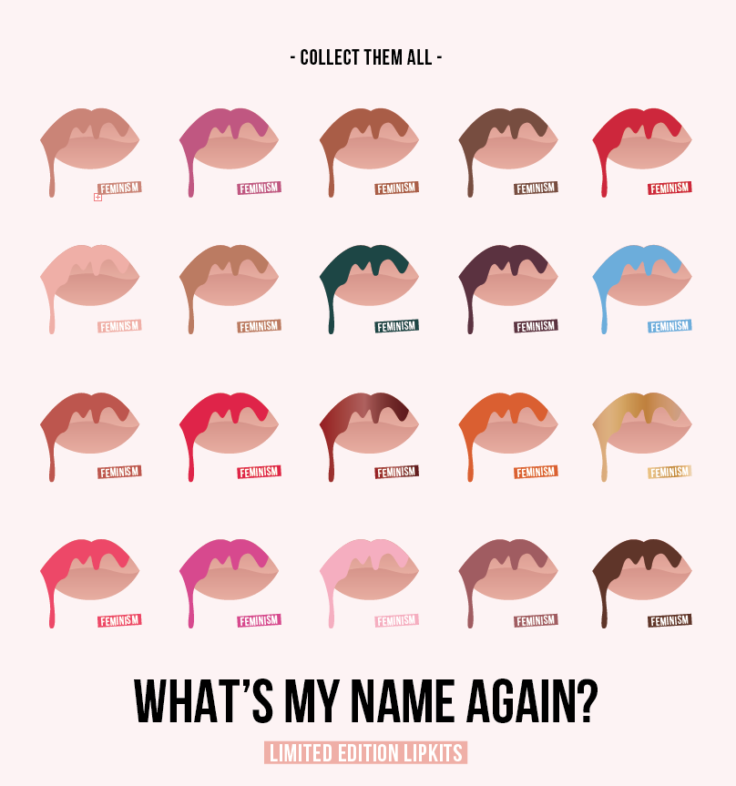
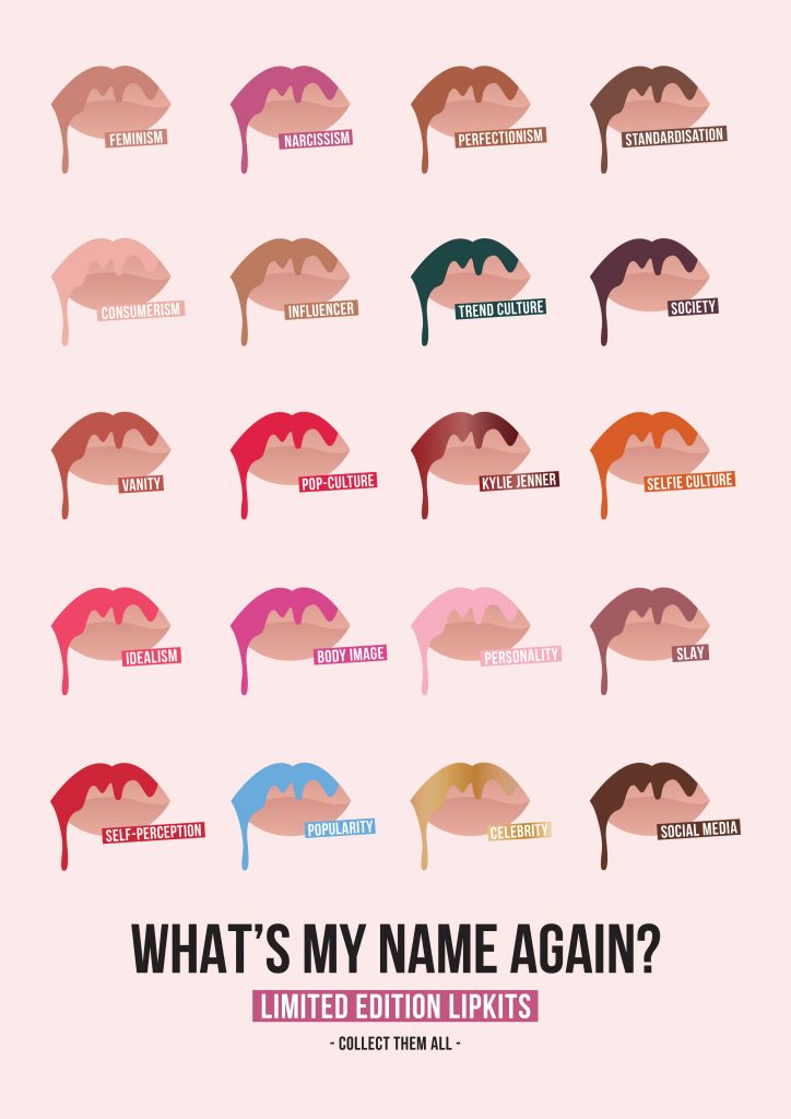
I wanted to try and add some consistency to the postcards whilst hinting it at the issue at hand with the tag line, “what’s my name again?” and “collect them all” encouraging a theme whilst adding further context to the topic/issue at hand of consumerism, brand culture and its impact on our self-perception. I feel that this works well on the poster with different theories/colour swatches and could be subtly introduced into the postcards in this manner.

I also experimented with format – landscape and portrait – as I felt in some cases as shown below, the composition of the design elements sat better and utilised any ‘dead space’ much better using landscape format, than portrait, however for the final resolution I would like them all to be consistent or to have a series of each format simply for consistency.

screen-shot-2016-10-19-at-17-41-36

screen-shot-2016-10-19-at-17-39-14

screen-shot-2016-10-19-at-17-37-10

screen-shot-2016-10-19-at-17-25-22

screen-shot-2016-10-19-at-17-25-17 screen-shot-2016-10-19-at-17-25-12

Postcards for Print Tests (Matte & Gloss):

Similarly to the posters, I want to experiment with both Matte and Gloss finishes to see which gives better visual impact, works better visually and commercially , whilst hoping to be consistent with the posters.

postcards-2-rgb-07

postcards-2-rgb-01

postcards-2-rgb-02

postcards-2-rgb-03

postcards-2-rgb-04

postcards-2-rgb-05

postcards-2-rgb-06

Poster Print Tests: Matte and Gloss

This is working towards objective 4.C.

After experimenting with screen-printing last week, and since developing a further range of posters I wanted to try digitally printing on both Matte and Gloss stocks to see how viable these would be as commercial prints to sell as a way of engaging with the target audience, whilst be able to collate a final range of prints to take forward into semester two and develop into a realisable outcome.

As previously noted, I didn’t feel that screen-printing allowed for the depth or detail that I wanted to achieve through my design work, and felt that digitally printing would allow for the CADS to almost look photographic, whilst allowing the colours to pop. I also felt that digital posts on Instagram and a ‘digital age’ target audience would appeal better – as evidenced in the insights taken from such Instagram posts which I have previously analysed.

I felt that when I printed the Matte versions of the 4 posters which I have currently developed, I felt these didn’t give the right colour impact and brightness which I had expected and also didn’t feel that the print quality was the best to sell commercially. I then tried Gloss, as also seen below which I feel gave a much better instant impact of colour whilst the print quality was much higher. I noted on the Matte prints, that some of the shadows surrounding the CADs had rasterised strange when exported to a PDF, hence lowering the overall quality of the print. This was not the case with the gloss prints, and feel overall they are much more commercially viable whilst showcasing a ‘shiny’ finish adding even more depth to the gradients and colours used.

Photographs of both the Matte and Gloss print tests can be seen below.

Matte:

20161019_115149_1476874491534_resized

20161019_115153_1476874487126_resized

20161019_115159_1476874482817_resized

20161019_115203_1476874478809_resized

20161019_115216_1476874475017_resized

20161019_115219_1476874470664_resized

20161019_115227_1476874466737_resized

Gloss:

gloss-test

20161026_181713_1477519731067_resized

20161026_181703_1477519778625_resized

20161026_181707_1477519760281_resized


Artist Research: Barbara Kruger

During conversation with Bobbi, a fellow MA student regarding our current projects, Barbara Kruger’s work was discussed regarding its relevance to my practice. I had seen Barbara Kruger’s work before in galleries, and furthermore had taken influence from her practice, ethos and methods during my A Level’s studying Fine Arts.

However, in regards to my current practice and experimental projects I am undertaken, Kruger’s work resonates with mine on both a theoretical and visual manner in many respects, using copy to stimulate thought, and visuals to contextualise commercial, media and socio-cultural related issues.

I found the Kim Kardashian W cover to be particularly interesting, especially in regards to its execution. Appearing naked as in many of Kim Kardashian’s most famous Instagram shots and magazine covers, her body is covered by Kruger’s red and white slogans hinting at narcissism and self-obsession, which I found interesting as I have referenced and researched both Kim Kardashian and her sibling, Kylie Jenner in regards to my research question, whilst currently producing experimental posters and prints, for example, aimed at a range of the issues noted in Kruger’s works.

  • Power
  • ‘Social life’
  • Virtual worlds (digital age)
  • Media
  • Politics
  • Cultural hierarchies
  • Protest
  • Feminism
  • Critical Theory

I have also bolded any key points below across several quotes, which I feel really contextualise the relationship between Kruger’s works and my current practice/research. In addition, it is noted below that Kruger often used screen printing and photolithography to produce final resolutions of her works. I have already experimented with screen printing, and have evaluated my techniques and processes in a previous post, however feel that photolithography works much better for monochrome photos, and feel both in terms of cost and time digitally printing, or digitally curating my final resolutions may be the best outcome in regards to gaining best visual impact and detail from my works, whilst appealing to the target audiences of my works more appropriately.

I would be interested in recreating some digital pieces of work influenced directly by Kruger, however keeping true to the tone of voice and aesthetic which has already been established whilst experimenting so far, to see how the target audience engage with photographs rather than graphics, for example.

In a virtual world, virtual words are becoming virtually weightless, dematerialized. The more words wash over us, the less we understand them. And the less we are able to recognize which ones are influencing us—manipulating us subtly, invisibly, insidiously. Barbara Kruger rematerializes words, so that we can read them closely, deeply.” (3)

Barbara Kruger addresses media and politics in their native tongue: tabloid, sensational, authoritative, and direct. Kruger’s words and images merge the commercial and art worlds; their critical resonance eviscerates cultural hierarchies — everyone and everything is for sale.”(1)

“I try to deal with the complexities of power and social life, but as far as the visual presentation goes I purposely avoid a high degree of difficulty.” (4)
“Although my art work was heavily informed by my design work on a formal and visual level, as regards meaning and content the two practices parted ways.” (4)

kruger_your_bodyImage Source

“The year 1989 was marked by numerous demonstrations protesting a new wave of antiabortion laws chipping away at the 1973 Roe v. Wade Supreme Court decision. Untitled (Your body is a battleground) was produced by Kruger for the Women’s March on Washington in support of reproductive freedom. The woman’s face, disembodied, split in positive and negative exposures, and obscured by text, marks a stark divide. This image is simultaneously art and protest. Though its origin is tied to a specific moment, the power of the work lies in the timelessness of its declaration.”(1)

“The work is about…audience and the scrutiny of judgment…fashion and the imperialism of garments, community and the discourse of self-esteem, witnessing and the anointed moment, spectacle and the enveloped viewer, narrative and the gathering of incidents, simultaneity and the elusive now, digitals and the rush of the capture.” There’s much, much more just in case we miss any aspect of what “the work is about.” (3)

Sources:
(1) http://www.thebroad.org/art/barbara-kruger/untitled-your-body-battleground, Last Accessed: 17th October 2016
http://3.bp.blogspot.com/-cvbBJhTPsLY/TiKhoH1-mdI/AAAAAAAABTw/li4M_OKgwgw/s1600/2010-by-barbara-kruger-for-w-magazine-feat-kim-kardashian-0.jpg, Last Accessed: 17th October 2016
(2) http://www.moma.org/collection/works/64897, Last Accessed: 17th October 2016
(3) http://www.smithsonianmag.com/arts-culture/barbara-krugers-artwork-speaks-truth-to-power-137717540/#XFFbuSxTRH8Rzi4i.99, Last Accessed: 17th October 2016
(4) https://www.google.co.uk/search?q=barbara+kruger&biw=1179&bih=1276&source=lnms&sa=X&ved=0ahUKEwiS8c7f6OLPAhVMKcAKHXXxAikQ_AUIBygA&dpr=1#q=Barbara+Kruger+Quotes, Last Accessed: 17th October 2017

Kylie Cosmetics: In Context on Instagram

This is working towards objective 1, 4.C, 4.D.

I have posted several screenshots below whilst looking through Kylie Jenners, ‘Kylie Cosmetics’ Instagram account, in order to gain information on new colours which could be used on the posters and blogging posts I am current experimenting with. I wanted to ensure that I am currently upto date with the 8.6m followers which the account has in order to engage with and appeal to the right audience through my critical-design led approach to blogging posts.

I also found the posts below interesting to show and reflect on in regards to the amount of interaction from followers, whilst noting how new shades, are released with perfect timing for seasonal events keeping up with relevant marketing and promotion, whilst also showing ‘followers’ selfies intermingled with Kylie Jenners – allowing for users to think if they can look ‘to the same standard’ using her products, maybe they will be noticed and featured too. In turn this does affect our self-perception, through changing our attitude and appearance to follow a trend and fit in with a certain community.

In addition it is important for me to see what is happening in this community whilst working on such related design work, and especially whilst starting to plan my initial zine, based on Kylie Jenner and her cosmetics brand. A rationale for this decision can be seen in my previous post regarding planning and prototyping.

Furthermore, it is interesting to see how relatively new technologies such as the KYLIE app for example is intermingled through posts, again advertising another of her products, and leading those to download the app showcasing such a consumer and brand led culture of the digital age. Furthermore videos can also be seen on the Instagram page itself, showing short snippets of advertisements, swatches or tutorials from Kylie. This level of engagement and user-interaction, with links to her website to buy products, and links to other tagged members allows for users to feel apart of the community as noted above.

screenshot_2016-10-15-00-49-18_1476565728513 screenshot_2016-10-15-00-49-47_1476565728831 screenshot_2016-10-15-00-50-25_1476565729055 screenshot_2016-10-15-00-50-36_1476565729287 screenshot_2016-10-15-00-50-47_1476565729561 screenshot_2016-10-15-00-51-24_1476565730517 screenshot_2016-10-15-00-51-31_1476565730789 screenshot_2016-10-15-00-51-56_1476565731931 screenshot_2016-10-15-00-52-58_1476565733664 screenshot_2016-10-15-00-54-11_1476565733332 screenshot_2016-10-15-18-32-21_1476565732878 screenshot_2016-10-15-18-32-31_1476565734112
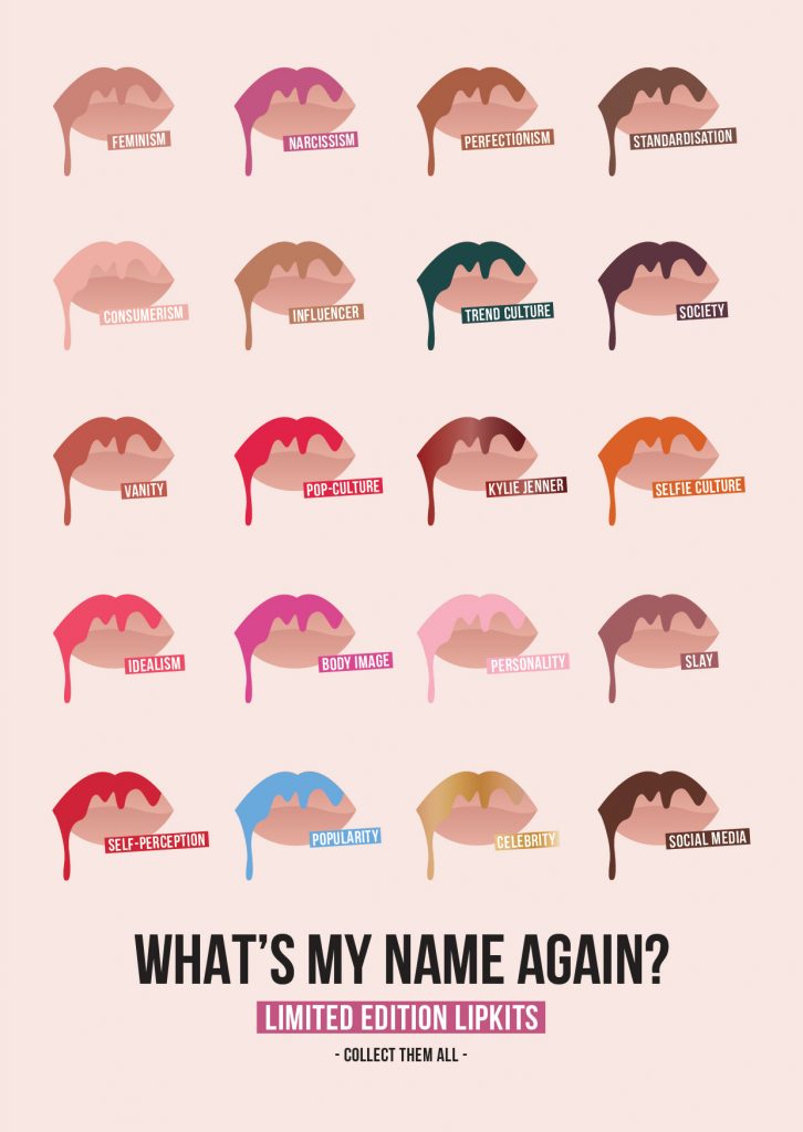
Image Source

Poster Idea Development

This is working towards objective 4.C.

IDEA: A3 Posters, targeting and addressing how social media, brand culture and celebrity status within the Beauty Industry, affect our self-perception.

mind-maps-1-6

screen-shot-2016-10-15-at-19-30-04

screen-shot-2016-10-15-at-19-36-16

screen-shot-2016-10-15-at-19-37-06

screen-shot-2016-10-15-at-20-00-51

screen-shot-2016-10-15-at-20-19-13 screen-shot-2016-10-15-at-20-45-03

screen-shot-2016-10-15-at-21-19-58

screen-shot-2016-10-15-at-21-27-09

A3 Posters, showcasing in a commercial and satirical visual manner how social media, brand culture and celebrity status within the Beauty Industry, affect our self-perception.

instagram-posters-rgb-02

instagram-posters-rgb-01

instagram-posters-rgb-03

instagram-posters-rgb-04

Zine Prototyping: Kylie Jenner – Content Plan

This is working towards objective 4.D.

Below shows my initial thoughts and initial content plan for my first prototyped zine, leading on from some of the Instagram Blogging Posts/Poster Prints I have been developing.

These Posts/Prints have been covering a range of topics in a satirical, lounge-in-chic and bold banner, hoping to engage with the audience and provoke thought. Themes covered include:

  • Consumerism
  • Trends
  • Celebrity Culture
  • Sociology and Psychology
  • Self-Perception
  • Brand Culture
  • Narcissism
  • The Self

I have decided to focus this initial zine prototype on Kylie Jenner for several reasons. My reasons for this decision are noted below:

  • Current influencer status
  • Personal issues with body image and self-perception, spurring her on to change her looks and then create a brand out of it, allowing for a trend to be found
  • Brand power due to celebrity status
  • Engagement and insights from my Instagram Posts show that the posts relative to Kylie Jenner’s, ‘Kylie Cosmetics’ were most seen, ‘liked’ and commented on, showcasing her current popularity within the social media communities
  • Kylie Jenner also has her own App and YouTube channel, allowing followers to watch her day-to-day life, ‘getting ready routines’, makeup secrets and live-stream videos for example, allowing a multitude of platforms for KJ to engage with and influence her following, whether in regards to looks or product-led consumer choices

kylie-zine

Further Instagram Blogging Posts

This is working towards objective 4.A and 1.

View the posts on Instagram, here!

instagram-16

Caption: “Consumer culture strikes again! Who caved into the ‘Birthday Editions’? Was gold lips even a thing before Kylie Jenner?”

instagram-13

Caption: Drippy Lips

instagram-14

Caption: Apparently these are the top beauty hashtags on Instagram. Who wants to be apart of the fame game?

instagram-12

Caption: Close Ups – Posters, Postcards and Zines coming soon