Postcards: Development and Experiments

This is working towards objective 4.C.

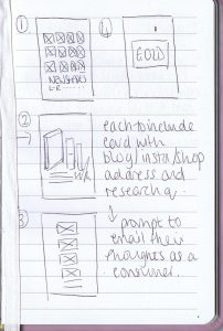
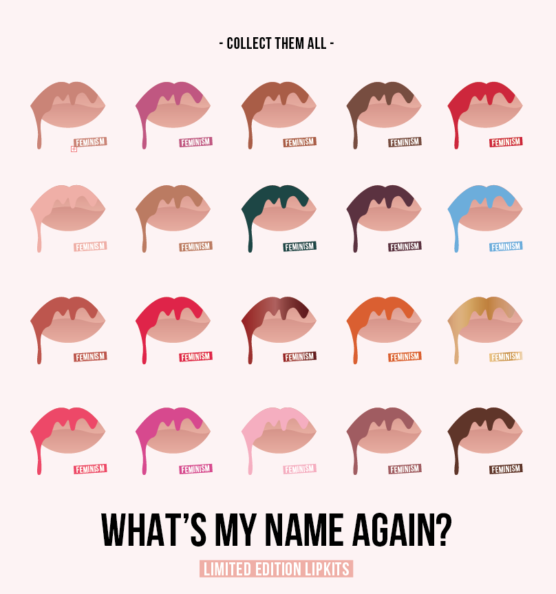
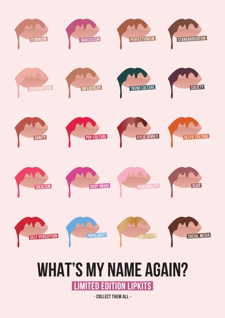
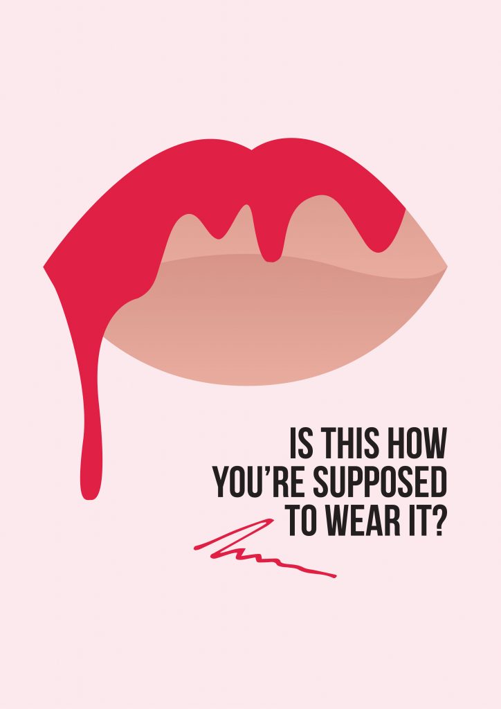
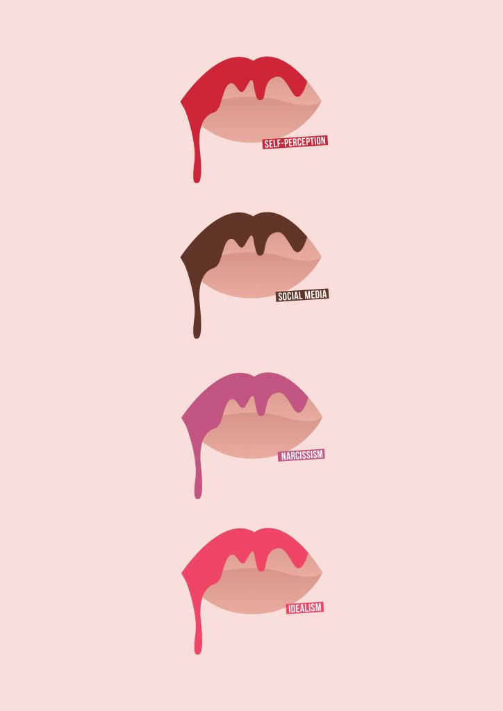
Adapting the posters into postcards was a part of the Poster Series/Blogging Posts brief that I had not planned on originally, however felt they may be good promos or teasers to hand out promoting the final series of posters for example if this is realised into a final project. I also envision these to be handed out in promo packs, consisting of Tote Bags, Posters and Postcards. Therefore, below shows my experiments with layout and composition.

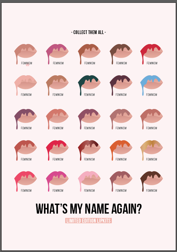
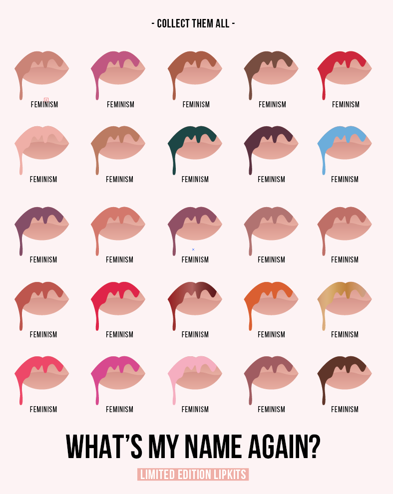
I wanted to try and add some consistency to the postcards whilst hinting it at the issue at hand with the tag line, “what’s my name again?” and “collect them all” encouraging a theme whilst adding further context to the topic/issue at hand of consumerism, brand culture and its impact on our self-perception. I feel that this works well on the poster with different theories/colour swatches and could be subtly introduced into the postcards in this manner.

I also experimented with format – landscape and portrait – as I felt in some cases as shown below, the composition of the design elements sat better and utilised any ‘dead space’ much better using landscape format, than portrait, however for the final resolution I would like them all to be consistent or to have a series of each format simply for consistency.

screen-shot-2016-10-19-at-17-41-36

screen-shot-2016-10-19-at-17-39-14

screen-shot-2016-10-19-at-17-37-10

screen-shot-2016-10-19-at-17-25-22

screen-shot-2016-10-19-at-17-25-17 screen-shot-2016-10-19-at-17-25-12

Postcards for Print Tests (Matte & Gloss):

Similarly to the posters, I want to experiment with both Matte and Gloss finishes to see which gives better visual impact, works better visually and commercially , whilst hoping to be consistent with the posters.

postcards-2-rgb-07

postcards-2-rgb-01

postcards-2-rgb-02

postcards-2-rgb-03

postcards-2-rgb-04

postcards-2-rgb-05

postcards-2-rgb-06

Poster Print Tests: Matte and Gloss

This is working towards objective 4.C.

After experimenting with screen-printing last week, and since developing a further range of posters I wanted to try digitally printing on both Matte and Gloss stocks to see how viable these would be as commercial prints to sell as a way of engaging with the target audience, whilst be able to collate a final range of prints to take forward into semester two and develop into a realisable outcome.

As previously noted, I didn’t feel that screen-printing allowed for the depth or detail that I wanted to achieve through my design work, and felt that digitally printing would allow for the CADS to almost look photographic, whilst allowing the colours to pop. I also felt that digital posts on Instagram and a ‘digital age’ target audience would appeal better – as evidenced in the insights taken from such Instagram posts which I have previously analysed.

I felt that when I printed the Matte versions of the 4 posters which I have currently developed, I felt these didn’t give the right colour impact and brightness which I had expected and also didn’t feel that the print quality was the best to sell commercially. I then tried Gloss, as also seen below which I feel gave a much better instant impact of colour whilst the print quality was much higher. I noted on the Matte prints, that some of the shadows surrounding the CADs had rasterised strange when exported to a PDF, hence lowering the overall quality of the print. This was not the case with the gloss prints, and feel overall they are much more commercially viable whilst showcasing a ‘shiny’ finish adding even more depth to the gradients and colours used.

Photographs of both the Matte and Gloss print tests can be seen below.

Matte:

20161019_115149_1476874491534_resized

20161019_115153_1476874487126_resized

20161019_115159_1476874482817_resized

20161019_115203_1476874478809_resized

20161019_115216_1476874475017_resized

20161019_115219_1476874470664_resized

20161019_115227_1476874466737_resized

Gloss:

gloss-test

20161026_181713_1477519731067_resized

20161026_181703_1477519778625_resized

20161026_181707_1477519760281_resized


Questionnaire’s: On Hold

After beginning to plan my initial questionnaire’s and surveys surround the beauty/fashion industries and technologies, as seen on a previous post, I have decided that it is best to hold off until post-December when I have collated the majority of secondary resources, allowing me to write better questions and gain better answers.

I also want to spend longer looking at different ways of putting the quesionnaire’s/survey’s together in regards to data analysis. I also do not want to conduct research now which may not be as relevant once I have conducted more theoretical research also, and have carried out some more interviews with Industry (i.e. ASOS), as this may then require the questionnaire’s/survey’s to be re-written and re-sent out.

Furthermore, I also feel it would be beneficial to wait until the research lecture series has been completed so I am aware of the research options I have therefore making an informed and not-rushed decision. I would rather wait and ensure the research and answers are constructive and relevant, when I feel more confident with the research and knowledge I will of obtained in the first semester.

I still plan on researching contexts, technologies and theories for example, whilst interviewing those working in industry currently to help shape the research questions going forward.

In addition, with an International Research trip planned to visit Japan in Jan 2017, in order to explore my research question on a cross-cultural level, I feel this may also influence questions.


The Fashion Conference Symposium at Manchester Art Gallery

After receiving the itinerary for the Fashion Conference Symposium at Manchester Art Gallery on Working in Industry (Friday 14th Oct) I came to realise that the event was aimed more at Fashion Design Graduates and how to start their own businesses post HE opposed to discussing the working Fashion Industry as whole, I decided to not attend as I did not feel I would gain enough out of it to miss a day of lectures. I also feel that now knowing the full itinerary I wouldn’t of been able to aquire all of the information I originally had noted or expected.

I felt that Annabeth’s lecture on Technologies, Video and Animation along with her practice would be of more benefit in advance to the Professional Context presentations. In addition, this would allow me to understand different technologies more which has since helped with further analysis and critique of new technologies in the fashion and beauty industries in relation to my practice. I wouldnt of been able to obtain such relevant and important knowledge had I of missed this lecture in return for the Working in Industry symposium.

Artist Research: Barbara Kruger

During conversation with Bobbi, a fellow MA student regarding our current projects, Barbara Kruger’s work was discussed regarding its relevance to my practice. I had seen Barbara Kruger’s work before in galleries, and furthermore had taken influence from her practice, ethos and methods during my A Level’s studying Fine Arts.

However, in regards to my current practice and experimental projects I am undertaken, Kruger’s work resonates with mine on both a theoretical and visual manner in many respects, using copy to stimulate thought, and visuals to contextualise commercial, media and socio-cultural related issues.

I found the Kim Kardashian W cover to be particularly interesting, especially in regards to its execution. Appearing naked as in many of Kim Kardashian’s most famous Instagram shots and magazine covers, her body is covered by Kruger’s red and white slogans hinting at narcissism and self-obsession, which I found interesting as I have referenced and researched both Kim Kardashian and her sibling, Kylie Jenner in regards to my research question, whilst currently producing experimental posters and prints, for example, aimed at a range of the issues noted in Kruger’s works.

  • Power
  • ‘Social life’
  • Virtual worlds (digital age)
  • Media
  • Politics
  • Cultural hierarchies
  • Protest
  • Feminism
  • Critical Theory

I have also bolded any key points below across several quotes, which I feel really contextualise the relationship between Kruger’s works and my current practice/research. In addition, it is noted below that Kruger often used screen printing and photolithography to produce final resolutions of her works. I have already experimented with screen printing, and have evaluated my techniques and processes in a previous post, however feel that photolithography works much better for monochrome photos, and feel both in terms of cost and time digitally printing, or digitally curating my final resolutions may be the best outcome in regards to gaining best visual impact and detail from my works, whilst appealing to the target audiences of my works more appropriately.

I would be interested in recreating some digital pieces of work influenced directly by Kruger, however keeping true to the tone of voice and aesthetic which has already been established whilst experimenting so far, to see how the target audience engage with photographs rather than graphics, for example.

In a virtual world, virtual words are becoming virtually weightless, dematerialized. The more words wash over us, the less we understand them. And the less we are able to recognize which ones are influencing us—manipulating us subtly, invisibly, insidiously. Barbara Kruger rematerializes words, so that we can read them closely, deeply.” (3)

Barbara Kruger addresses media and politics in their native tongue: tabloid, sensational, authoritative, and direct. Kruger’s words and images merge the commercial and art worlds; their critical resonance eviscerates cultural hierarchies — everyone and everything is for sale.”(1)

“I try to deal with the complexities of power and social life, but as far as the visual presentation goes I purposely avoid a high degree of difficulty.” (4)
“Although my art work was heavily informed by my design work on a formal and visual level, as regards meaning and content the two practices parted ways.” (4)

kruger_your_bodyImage Source

“The year 1989 was marked by numerous demonstrations protesting a new wave of antiabortion laws chipping away at the 1973 Roe v. Wade Supreme Court decision. Untitled (Your body is a battleground) was produced by Kruger for the Women’s March on Washington in support of reproductive freedom. The woman’s face, disembodied, split in positive and negative exposures, and obscured by text, marks a stark divide. This image is simultaneously art and protest. Though its origin is tied to a specific moment, the power of the work lies in the timelessness of its declaration.”(1)

“The work is about…audience and the scrutiny of judgment…fashion and the imperialism of garments, community and the discourse of self-esteem, witnessing and the anointed moment, spectacle and the enveloped viewer, narrative and the gathering of incidents, simultaneity and the elusive now, digitals and the rush of the capture.” There’s much, much more just in case we miss any aspect of what “the work is about.” (3)

Sources:
(1) http://www.thebroad.org/art/barbara-kruger/untitled-your-body-battleground, Last Accessed: 17th October 2016
http://3.bp.blogspot.com/-cvbBJhTPsLY/TiKhoH1-mdI/AAAAAAAABTw/li4M_OKgwgw/s1600/2010-by-barbara-kruger-for-w-magazine-feat-kim-kardashian-0.jpg, Last Accessed: 17th October 2016
(2) http://www.moma.org/collection/works/64897, Last Accessed: 17th October 2016
(3) http://www.smithsonianmag.com/arts-culture/barbara-krugers-artwork-speaks-truth-to-power-137717540/#XFFbuSxTRH8Rzi4i.99, Last Accessed: 17th October 2016
(4) https://www.google.co.uk/search?q=barbara+kruger&biw=1179&bih=1276&source=lnms&sa=X&ved=0ahUKEwiS8c7f6OLPAhVMKcAKHXXxAikQ_AUIBygA&dpr=1#q=Barbara+Kruger+Quotes, Last Accessed: 17th October 2017

Questionnaire and Survey Planning: Beauty Apps & Photo-editing

This is working towards objective 3 and 1.

research-1-1

research-1

Upon further discussion of these questionnaire’s with fellow MA student Bobbi, it arised that some women for example, may take offence to the second form of questionnaire, particularly feminists, whom may think ethically this is wrong. I found this point really interesting as this had not crossed my mind. This form of this particular visual research was to find out what people currently find attractive in a booming digital age whereby many are falling for the trend traps set out by bloggers, brands and celebrities for example over-editing selfies and engaging with makeup trends due to societies ever changing norms and ideals. I want to find out whether this in turn, effects how we see other people as well as ourselves. Does how we perceive other people affect how we end up seeing ourselves or our partners for example?

I take into consideration any ethical issues which may arise, however wish to see if this form of research is beneficiary in regards to unpicking my research question.


Kylie Cosmetics: In Context on Instagram

This is working towards objective 1, 4.C, 4.D.

I have posted several screenshots below whilst looking through Kylie Jenners, ‘Kylie Cosmetics’ Instagram account, in order to gain information on new colours which could be used on the posters and blogging posts I am current experimenting with. I wanted to ensure that I am currently upto date with the 8.6m followers which the account has in order to engage with and appeal to the right audience through my critical-design led approach to blogging posts.

I also found the posts below interesting to show and reflect on in regards to the amount of interaction from followers, whilst noting how new shades, are released with perfect timing for seasonal events keeping up with relevant marketing and promotion, whilst also showing ‘followers’ selfies intermingled with Kylie Jenners – allowing for users to think if they can look ‘to the same standard’ using her products, maybe they will be noticed and featured too. In turn this does affect our self-perception, through changing our attitude and appearance to follow a trend and fit in with a certain community.

In addition it is important for me to see what is happening in this community whilst working on such related design work, and especially whilst starting to plan my initial zine, based on Kylie Jenner and her cosmetics brand. A rationale for this decision can be seen in my previous post regarding planning and prototyping.

Furthermore, it is interesting to see how relatively new technologies such as the KYLIE app for example is intermingled through posts, again advertising another of her products, and leading those to download the app showcasing such a consumer and brand led culture of the digital age. Furthermore videos can also be seen on the Instagram page itself, showing short snippets of advertisements, swatches or tutorials from Kylie. This level of engagement and user-interaction, with links to her website to buy products, and links to other tagged members allows for users to feel apart of the community as noted above.

screenshot_2016-10-15-00-49-18_1476565728513 screenshot_2016-10-15-00-49-47_1476565728831 screenshot_2016-10-15-00-50-25_1476565729055 screenshot_2016-10-15-00-50-36_1476565729287 screenshot_2016-10-15-00-50-47_1476565729561 screenshot_2016-10-15-00-51-24_1476565730517 screenshot_2016-10-15-00-51-31_1476565730789 screenshot_2016-10-15-00-51-56_1476565731931 screenshot_2016-10-15-00-52-58_1476565733664 screenshot_2016-10-15-00-54-11_1476565733332 screenshot_2016-10-15-18-32-21_1476565732878 screenshot_2016-10-15-18-32-31_1476565734112

Image Source

Poster Idea Development

This is working towards objective 4.C.

IDEA: A3 Posters, targeting and addressing how social media, brand culture and celebrity status within the Beauty Industry, affect our self-perception.

mind-maps-1-6

screen-shot-2016-10-15-at-19-30-04

screen-shot-2016-10-15-at-19-36-16

screen-shot-2016-10-15-at-19-37-06

screen-shot-2016-10-15-at-20-00-51

screen-shot-2016-10-15-at-20-19-13 screen-shot-2016-10-15-at-20-45-03

screen-shot-2016-10-15-at-21-19-58

screen-shot-2016-10-15-at-21-27-09

A3 Posters, showcasing in a commercial and satirical visual manner how social media, brand culture and celebrity status within the Beauty Industry, affect our self-perception.

instagram-posters-rgb-02

instagram-posters-rgb-01

instagram-posters-rgb-03

instagram-posters-rgb-04

Zine Prototyping: Kylie Jenner – Content Plan

This is working towards objective 4.D.

Below shows my initial thoughts and initial content plan for my first prototyped zine, leading on from some of the Instagram Blogging Posts/Poster Prints I have been developing.

These Posts/Prints have been covering a range of topics in a satirical, lounge-in-chic and bold banner, hoping to engage with the audience and provoke thought. Themes covered include:

  • Consumerism
  • Trends
  • Celebrity Culture
  • Sociology and Psychology
  • Self-Perception
  • Brand Culture
  • Narcissism
  • The Self

I have decided to focus this initial zine prototype on Kylie Jenner for several reasons. My reasons for this decision are noted below:

  • Current influencer status
  • Personal issues with body image and self-perception, spurring her on to change her looks and then create a brand out of it, allowing for a trend to be found
  • Brand power due to celebrity status
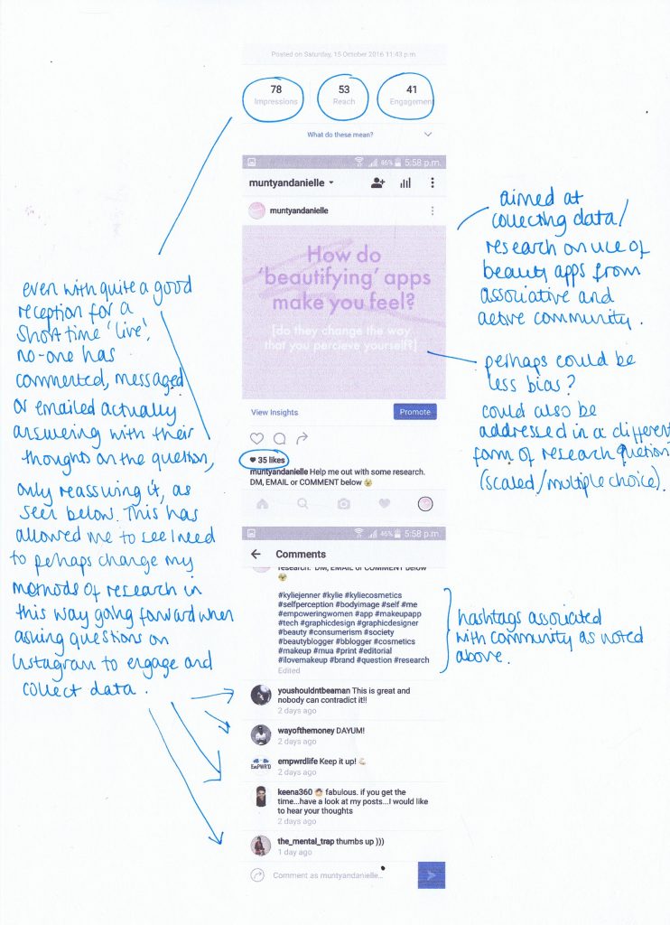
  • Engagement and insights from my Instagram Posts show that the posts relative to Kylie Jenner’s, ‘Kylie Cosmetics’ were most seen, ‘liked’ and commented on, showcasing her current popularity within the social media communities
  • Kylie Jenner also has her own App and YouTube channel, allowing followers to watch her day-to-day life, ‘getting ready routines’, makeup secrets and live-stream videos for example, allowing a multitude of platforms for KJ to engage with and influence her following, whether in regards to looks or product-led consumer choices

kylie-zine